MP 29 (Chapter 8)
1.) Many dot-com's have failed in the past due to faulty business models and a lack up updated content.
2.) The separation of content and formatting is applied through dynamic content publishing.
3.) Dynamic content publishing updates a site's information which helps to eliminate costs associated with content delivery.
4.) The complexity of HTML code can bury important information within its content, making it difficult to update,
5.) Web content alone is rarely a sustainable source of income for Web entrepreneurs. This has caused many organizations to offer online services to create profit.
6.) Templates are important in dynamic content publishing because they take stark content and transform it into usable webpages.
7.) Current web applications allow a user to go beyond simple information and provide a means to actually get work done, such as paying taxed or organizing a book collection.
8.) Web applications allow the user to interact with the page causing them to invest a significant amount of time with the interface.
9.) Full screen mode and a browser-less window creates a unique interface and maximizes the display area available for the application.
10.) Nonstandard interactions, frames, and plug-in technologies increases web application usability by adding functionality.
Friday, December 15, 2006
MP 27 (Chapter 7)
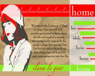
1.) The responsibilities of a home page are grouped into three categories: introduction, entrance, and annoucement.
2.) Because the home page gets the most exposure, it is important to make it as visually stimulating as possible.
3.) It is important to not get carried away with the visual appearance of a page. Large, gaudy logos can congest the page and take away the home page's main goals.
4.) The strongest visual elements of the home page should be directly related to the site's most important information.
5.) Related content should share a visual relationship to give the viewer a clear understanding of the content.
MP 25 (Chapter 6)
1.) By categorizing the basic elements of a webpage by their function, it makes it easier to determine where they should be placed within the visual hierarchy.
2.) Different websites share many of the same basic elements which is why most layouts are typically similar.
3.) If a website has an overwhelming amount of information, it is important that the navigation is clear and distinct.
4.) Different people have different choices in the way they navigate through a page which is why a site should have alternative methods so as to cater to specific needs.
5.) The navigation system should remain in the same place throughout the different pages in order to remain available when needed.
6.) Font, spacing, and type size should all be considered when creating body text. A wrong choice could make the information difficult to read.
7.) Images create the personality of a page and are one of the first elements that capture the viewers attention.
8.) When dealing with an abundance of images it is important to apply techniques such as compression, resizing, zoom-in views, and the use of IMG tag attributes so as keep the download time minimal.
9.) A page footers goal is to reveal the origin of content. A viewer is most likely not as concerned with this information as compared to the body text which is why is located at the bottom of the page.
10.) Forms determine the viewer's unique interests and provide direct navigation based on their specific needs.
Thursday, December 07, 2006
Mission Statement: Major Project 3
For my final major project I plan to create a website for QU Branches. It is clear that the site needs to be cleaned up. The information is off centered, the colors are drab and the style of the buttons needs to be updated. My idea is to modernize the site's logo and use that as the focal point of the design. The information will be presented cleanly and clearly with updates and the calendar in the middle so as to capture the viewers immediate attention. Those that access the site will be provided with an adequate amount of information that will hopefully aide them in their decision to join the ministry.
For my final major project I plan to create a website for QU Branches. It is clear that the site needs to be cleaned up. The information is off centered, the colors are drab and the style of the buttons needs to be updated. My idea is to modernize the site's logo and use that as the focal point of the design. The information will be presented cleanly and clearly with updates and the calendar in the middle so as to capture the viewers immediate attention. Those that access the site will be provided with an adequate amount of information that will hopefully aide them in their decision to join the ministry.
Thursday, October 26, 2006
web page draft/ chapter 6
Chapter 6: Start Communicating
1.) Page footers, body text, links, navigation systems, images, site id's, and forms all have different hierarchial functions on a web page and should be presented accordingly.
2.) The constraints of the web should not limit a designer but rather force them to become creative and solve the problem in their own unique fashion.
3.) A well presented navigation highlights the designers personality but also does not influence or effect the site's basic design.
4.) By keeping the navigation as clean and simple as possible it eliminates the visual noise that could slow the user's movement throught the page.
5.) By keeping the navigation bar on the side of every page, it allows the user to move freely when they are finished with one section but does not distract them from the page's content.
My web page:
Friday, October 20, 2006
Chapter 5: who are you? get a personality
1.)Media applications have distinct characteristics that combine to form a web site's personality. This personality is important because it responsible for the initial reaction of the viewer.
2.) A site's personality is defined by the designer's color choices, type choices, and images.
3.) A site has a personality even if it was not the designer's intent to create one.
4.) A professional site design has the ability to sell the product endorsed without having to textually convince the audience of its worth.
5.) Once the target audience is defined, the designer must then create the site's personality based on what they would like to see and what will invoke them to return.
6.) A unique site personality is one of the most important aspects of its creation. A unique design will help the page stand out against the millions of others on the web.
7.) The audience's first impression is very important because it is when they decide if they want to look further or go somewhere else. The design must invite and engage the viewer.
8.) Colors elicit certain reactions and are important when defining a site's personality.
9.) When deciding on color combinations, it is important to choose one main color as the dominant color for the page. There should not be colors "competing" for attention because it will distract from the main focus of the page.
10.) Typefaces can describe the mood of the page whether it be aggressive, with bold letters or mellow with smooth characters.
Friday, October 13, 2006
Chapter 4
1.) It is important that the images on a web page are not only attractive but help convey the message of the site. They should initially engage the user and eventually direct them to the information provided. This allows for less time spent navigating and more time spend learning the site's purpose.
2.) Visual organization is accomplished by consistant color choices, a simple navigation style, and textual hierarchy.
3.)Visual weight highlights important information through the use of bold colors and large shapes. The user's eye is immediately drawn to the larger, more intensely colored elements first. Through a scaling down process of shapes, the less important information is seen based on their appearance.
4.)For a site to be distinushable it is important for a designer a consistant style throughout their page. Through the unified graphical elements, a page becomes more easily identifiable.
5.) The use of white space is an easy way to keep important information highlighted. It gives the text "room to breath" and helps it stand out from the rest of the page.
Thursday, October 05, 2006
Chapter 3
1.) Technical details are an important factor when designing a web page. If these details are not considered the site may not function properly which could lose a user's interest when browsing the page.
2.) To keep the audience's attention when accessing a site it is important to rememeber to optimize download times, create scannable pages, and minimize complex interactions. This will keep their focus on the information on the page and not on the amount of time they are waiting to recieve it.
3.) The content order of appearance is important during the download period of a site. Put the most visualy stimulating images and most important information first. This will keep the user entertained while the rest of the site is processing.
4.) It is also important to tell the user how much time is left in the download or why they could not reach a certain section of the page. This keeps the communication between designer and user strong a gives the user a full understanding of when the information will be presented.
5.) Using the unified model of the web when designing a page will keep the user comforable because it is something that they have used before and it will allow them to navigate through the site with ease.
Mission Satement: Atlantic Freedom Tour
The Atlantic Freedom Tour website will allow it's viewers a first-hand look at the daily life of those aboard the Amistad. This will be obtained through an easy-to-navigate page which will hold daily blogs of the participating students, a virtual webcam, and an in-depth narrative of the trip's initial goals. Information will be presented through a series of the tabs marking each port the ship will dock. The user will learn the historical importance of each port and the individual experiences of those involved. The webpage's main objective is to engage the user's interest by having a constant flow of new information each day with pictures and film to accompany it.
The Atlantic Freedom Tour website will allow it's viewers a first-hand look at the daily life of those aboard the Amistad. This will be obtained through an easy-to-navigate page which will hold daily blogs of the participating students, a virtual webcam, and an in-depth narrative of the trip's initial goals. Information will be presented through a series of the tabs marking each port the ship will dock. The user will learn the historical importance of each port and the individual experiences of those involved. The webpage's main objective is to engage the user's interest by having a constant flow of new information each day with pictures and film to accompany it.
Thursday, September 28, 2006
Chapter 2
1.) By dividing a site's information in categories, it will make the task of presenting what's most important easier during the first initial steps of a site's creation.
2.) It is important to understand who the target audience of the website will be order to properly and efficiently accounted their needs.
3.) The navigation elements of the site should be presently clearly so that the viewer can easily access the information they are looking for. This is done by initially creating a navigation frame which levels off the most important information to the lest important.
4.) A web site should have a "voice" that communicated to the viewer through the visual presentation of information.
5.) The best way to keep a site organized is by planning ahead, coming up with mind maps, and to have a full understanding of the site's target audience and initial goals.
Mission Statement: Campus Ministry
My goal of redesigning the Campus Ministry webpage is to make the site easily accessible, modern and clean. Because it's a religious-based site I want the overall look to be mellow and zen. I will create this effect by using muted colors and round- edged shapes. A Quinnipiac student who logs on to the site looking for information will find the most important news laid out to them in a bold, clear manner. The webpage will provide pictures and contact information of the Pastoral Leadership Counsel as well as an overview of the ministry as a whole. I want those who access the site to understand exactly what the Ministry stands for and provides and will hopefully be inspired to learn more.
My goal of redesigning the Campus Ministry webpage is to make the site easily accessible, modern and clean. Because it's a religious-based site I want the overall look to be mellow and zen. I will create this effect by using muted colors and round- edged shapes. A Quinnipiac student who logs on to the site looking for information will find the most important news laid out to them in a bold, clear manner. The webpage will provide pictures and contact information of the Pastoral Leadership Counsel as well as an overview of the ministry as a whole. I want those who access the site to understand exactly what the Ministry stands for and provides and will hopefully be inspired to learn more.
Thursday, September 21, 2006
Mission Statement:
My goal is to make a simple, clean page with one main image as the overall focus. This bold image will be used to initially draw the viewer in and make them interested in learning more about me. The simplicity of the page will allow the viewer to understand what is the most important information about me. The color scheme will consist of mostly greens, yellows and pinks which are my favorite color combinations. My hobbies, interests, and goals will all be presented in this site.
My goal is to make a simple, clean page with one main image as the overall focus. This bold image will be used to initially draw the viewer in and make them interested in learning more about me. The simplicity of the page will allow the viewer to understand what is the most important information about me. The color scheme will consist of mostly greens, yellows and pinks which are my favorite color combinations. My hobbies, interests, and goals will all be presented in this site.
Chaper 1
-The word "language" is not a term used literally when referring to the web. A web page's "language" is not only the textual information it holds but how the entire layout of a page "speaks" to its viewer. This is based on the organziation of the page and if it effectively communations the information it holds.
-To effectively communicate the overall message of a site, it is important to know the target audience of the site and base the organization and design on the users interests.
-To make the best site possible for a client, a design must fully understand the "message" of the company or organization. This is done by extensive research of the company and what their main goals are.
-A good web page is created through a designer's full understanding of a company and who their target audience is.
-Once the design has a complete understanding of the company and it's audience it will make the site's overall goal more clear and presented more efficiently.
Thursday, September 14, 2006
Introduction
-I like how the author started the introduction by comparing the evolution of a person and the evolution of the internet. Both started with very limited ways of communication but throughout their growth has gathered information and is now able to "speak" is a complex manner.
-Like a child developing in its adolencence, early computer models were "immature" and hard to operate. It took years of growth and developmemt for them for them to fuction properly.
-The World Wide Web has gone through 6 stages of development in its 10 years of life. Each stage learned from its predesessor through its evolution.
-6 stages of web development: the simple sharing era, the image and table era, the design intro era, the techno-hype era, the usability era, and the speaking web
-The simple sharing era was the web's beginning phase when only simple text was used to communicate between researchers and academics.
-The image/table era was a time when basic images as well as text were being shared by the limited users of the web. This blossomed into the creation of web sites and eventually into the first web browser (Netscape).
-The usability era was when the web began function better internally as well as externally. Usability professionals developed concepts to cut download times through minimizing page sizes. This made the web easily accessable.
-The web is now at a stage where its function is not an issue anymore. The internet is now an household name with millions of people using it to communicate and gather information. This makes the presentation of a web site one of the most important aspects of gaining viewers.

Thursday, September 07, 2006
The author's preface begins by stressing the importance of the visual presentation of a website. The images on a site are the first thing that the end user sees and draws interest from. If the design scheme is organized and visually appealing, it gives the user more incentive to browse the information on the page. The author explains that this book is not intended to give the reader step-by-step instructions on how to create a webpage. Rather he gives design "considerations" that are intended to inspire the reader to create original solutions to their own personal work. In the book he uses a wide range of example sites in order to show how designers create different solutions to fit their specific task.
Subscribe to:
Comments (Atom)